

Rhinebeck at Home, a new Logo Design for a Retiree Community.
My friend Mark H called and asked if I would like to collaborate on a logo for Rhinebeck at Home. A group of retirees who share common goals and activities, and reside in their own homes in the town of Rhinebeck, New York. The group of retirees maintains a website to communicate about current events and needed a new logo that reflects the town of Rhinebeck and specific activities, resources, and support for older people.
From the beginning, it was clear that the name Rhinebeck at Home could easily be mistaken for a retirement home. The word “home” would be important for the new visual solution; the logo design project ranged from poetic to playful to shared events to landmark. It should come as no surprise that “home” holds different meanings for people, both as individuals and as a collective.
The First Presentation, Finding the Right Direction.
Initially, I focused on creating a logo that hinted at the group’s positive activities, like gardening and hiking, and since the members are all baby boomers, I figured I could propose a design with a lean toward the music posters from the seventies. The first round was dismissed as too childlike or too happy; it boiled down to the fact that the design had to be approved by the board members, who needed to come to terms with the group’s core message.


The Second Presentation, After Fresh Input.
For the second presentation, we decided to float the layouts to the board members in advance of a large meeting. In addition, I wrote down my thoughts and inspiration for each layout. In retrospect, I probably should have done that for the first presentation as well. I tend to think that everybody has eyes and that the client ought to be able to make up their mind based on what they see. Here are my thoughts on each layout for the second presentation.
Friends dragged me over to the Rhinebeck Porch Fest last summer, and we got parking-lucky on West Market Street. As I got out of the car, I noticed several planted trees, bearing tiny fruit. As we walked to the festival, I noticed even more of these young trees lining the neighborhood. Obviously, the fruit was too small to be eaten, but the town’s tree plantings will be spectacular in Spring, I mused. Lots of retirement groups chose trees for their logos, so why not choose the tree’s flower? It symbolizes friendly openness and new beginnings. If you look carefully, you find an abstract house at the flower’s center. The logo design is future-oriented, as Rhinebeck has planted over 2,000 trees. The design is set on a dark blue background to let the white crab apple flower shine.


A good friend of mine always reminded me to leave extra room on her business cards and postcards so she could write something personal. These two layouts utilize this principle, the power of looking personal, like a friendly reminder note or mini art on a refrigerator door. The handwriting is not done to look like perfect calligraphy, but rather to be a personal note, inviting you to show up and participate. The two art choices reflect the river view and a simple town sketch. The town’s doodle conveys a Victorian town impression by depicting multiple buildings, such as the Wilderstein Estate and the Terrapin Restaurant, while avoiding a specific location. The color choices are on the blue and green-friendly side.
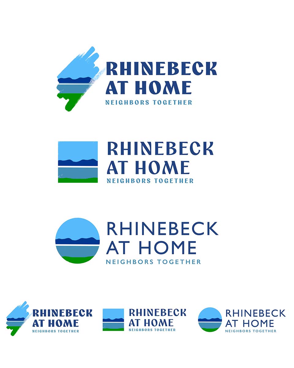
The location and the name Rhinebeck suggest that the Hudson River resembles the scenic Rhine River, which originates in Switzerland, flows through Germany, and enters the North Sea in the Netherlands. The town of Rhinebeck, located adjacent to the river, offers spectacular views of the Catskill Mountains, clearly reminiscent of the Rhine Valley. This layout reflects the cherished blue-sky riverfront view from Rhinebeck, suggesting a happy community. There are two font choices: one with a bit more character, suggesting history, arts and crafts, or Victorian times; and one that is more modern-looking but surprisingly is rooted in the same time period.

This design started with the idea of finding a font with a bit more character and a historical look, and adding a logo element inspired by the Arts and Crafts Movement. After searching for Victorian architectural shapes for inspiration, which yielded only very specific results, I started playing with blue romboids, which looked too German until I duplicated and flopped them. After coloring them a brick brown, the design began to resemble a quilt or tile pattern, with colors overlapping and spreading in a starlike pattern. Quits are made from multiple fabrics stitched together, resembling a community that shares interests and a sense of togetherness. In this design, the colors blue and brown overlap and form a new color that represents cross-interests. Like cooking and gardening, or chair yoga and puzzling. This layout has a sense of history, a center, expansion, and overlapping interests. The heavier fonts make the design more masculine, whereas the lighter font keeps it more balanced.
The Layout 12 also raised the question, can the angular rhomboid be made softer? How a bout an almond/boat shape? I colored the overlapping shapes in pale brick red and faint blue, so the colors blend into a darker purple where they intersect. In one variation, I replaced the center with a small house. The design is pretty, artful, and engaging, with no deeper meaning, and that is perhaps all it needs. Think of the Nike swoosh? Without you knowing it’s for a sports shoe company, it’s just a crooked smile. This design looks clean, friendly, unpretentious, and inviting to participate.


After a long search for a logo element inspired by the Arts and Crafts Movement, Victorian architectural shapes, or past-time tile patterns, I found nothing helpful. So I started playing with colored romboids, creating star-shaped patterns which soon reminded me of quilt patterns. My geometric interpretation led me to look up traditional quilt patterns for this design. The quilt pattern I found is perfect for Rhinebeck at Home. It has a square center (Montgomery/Market Street) with inward- and outward-pointing arrows, suggesting internal and external reflection. And don’t tell me you haven’t spotted them by now: the four white houses with brown roofs! Not everyone will perceive the design this way; most viewers will probably see it as a quilt pattern. Either way is perfect. The design can be colorized in 2, 3, or 4 colors and will look great in black and white if required.

The Final Logo, Community Shared Outlook.
I do remind my clients of the multitude of ways a logo will be used: horizontal, vertical, centered, in color or greyscale, and in print and on the internet, with all the adaptations. I created a few final logo files that will serve as cut-and-paste assets for all future use, including programs, banners, t-shirts, and sponsor ads.
Thanks to Mark, Eric, and the board members of Rhinebeck at Home for making this project possible.


